WANT TO BUY OR SELL A PROPERTY?

555-555-5555

mymail@mailservice.com


Kari Singleton, Realtor

Walker Real Estate Advisors

934 W Main St

Hillsboro, OH 45133

Office:  937.402.4092

Cell:     937.763.3228

2023 COLORS OF THE YEAR

karisingleton74 • May 31, 2023

2023 COLORS OF THE YEAR

Hot Trends for Self-Expression

Are you one of those people who love to follow trends? Maybe you're ready for a change or just want to freshen things up a bit. Well, you're in luck because the hottest colors of 2023 might be exactly what you need. This year offers a wide variety of hues, from soft romantic tones to warm natural shades, and even some bolder colors for the more daring. 2023 is all about expressing yourself. So, browse through and take a look at this year's top colors (listed in no particular order). You just may find the inspiration you're looking for!


Photo Courtesy of Sherwin Williams

Redend Point SW 9081 by Sherwin Williams is a warm, earthy tone that Sherwin Williams describes as minimal, calming, and intriguing. It is soft yet colorful at the same time. This shade works great on walls, furniture, or anywhere you want to create a cozy and inviting environment.


Photo Courtesy of Sherwin Williams

Photo Courtesy of Pantone

Viva Magenta 18-750 by Pantone takes us in a totally different direction. This is a bold, saturated color for those who aren't afraid to make a statement. Pantone describes Viva Magenta as a shade of red inspired by nature. In fact, it is inspired by the cochineal beetle which produces carmine dye that is known as one of the strongest and brightest natural dyes.  Pantone goes on to describe this color as empowering, electrifying, and joyous. If you're looking to make a bold statement, this just may be your color.


Photo Courtesy of Pantone

Photo Courtesy of Glidden

Vining Ivy by Glidden offers a rich blue-green jewel hue that works in literally any space. Glidden describes Vining Ivy as a "versatile vibe." It pairs well with wood or stone accents and offers a stunning backdrop to brighten up any room without overwhelming it. Or, dress up some furniture with this rich shade to add a pop of color and warmth.


Photo Courtesy of Glidden

Photo Courtesy of Krylon

Spanish Moss by Krylon is next up in our shades of green. This one, however, is a true green. No blue shades here. Ashley Banbury, Senior Color Designer for Krylon describes Spanish Moss states, 

“This midnight green has a strong connection with the richness of nature, dense forests and mossy terrains. Rooted in the renewing power of green, it can balance with both warm and cool accents.”  


This stunning green is perfect for indoor/outdoor furniture and accents. If you're looking for a way to bring the forest into your home, Spanish Moss could be the solution.


Photos Courtesy of Krylon

Photo Courtesy of Behr

Blank Canvas by Behr offers us a more neutral and relaxing environment. This creamy shade of white works in every single room of the house. It is warm and welcoming. It can stand alone on its own or can be paired with a wide variety of hues, including earth tones and pastels to create a more colorful and harmonious environment. Blank Canvas is perfect for those looking for a more neutral, yet still inviting space.


Photo Courtesy of Behr

Photo Courtesy of Dunn-Edwards

Terra Rosa by Dunn-Edwards is best described as a deep rosy pink mixed with the warm earthy tones of terra cotta. According to the Dunn-Edwards website, Terra Rosa is the culmination of 4 significant influences: 1. Health and Well-being, 2. Warming Hues of Reds and Oranges, 3. Nostalgia, and 4. Nature. This color is both neutral and dramatic. It can be romantic, bold, quiet, or grounding, but no matter which direction you take with Terra Rosa, it will always be pretty.


Photo Courtesy of Dunn-Edwards

Photo Courtesy of Benjamin Moore

Raspberry Blush by Benjamin Moore will make a statement with its bold, red-orange hues. This color is energetic and confident. Color is back in style, and there is no better way to say it than with Raspberry Blush. This color is not a backdrop; it is a centerpiece! Make a statement on your walls or use it on the trim or even ceilings to liven up any room. It's out with the old and in with the bold with Benjamin Moore's Raspberry Blush.


Photo Courtesy of Benjamin Moore

Image Courtesy of Better Homes & Gardens

Canyon Ridge by Better Homes and Gardens is another color with a terra cotta twist. It is a sunbaked coral shade that will have you dreaming of desert landscapes. It is soft yet vibrant. Canyon Ridge can be paired with rich denim blues for a more rustic look. Create a whole-room effect or use it as an accent. If you're looking for color without the over-the-top boldness, Canyon Ridge will give you a warm vibrant look.


Photo Courtesy of Better Homes & Gardens

Photo Courtesy of Dutch Boy

Rustic Greige by Dutch Boy brings us back to the neutral shades. This is a gray-beige combination with subtle shades of red that provides warmth and energy to a room. According to Dutch Boy, "Rustic Greige is a versatile neutral that brings harmony and contentment home. It’s an adaptable hue that grounds all three of our 2023 Color Trend palettes – Plush, Wistful, and Botanic."  If warm and cozy is what you're after, Rustic Greige could be for you.


Photo Courtesy of Dutch Boy

Photo Courtesy of Minwax

Aged Barrel by Minwax is a rustic, warm tone that will bring out the natural beauty in any wood surface. It will highlight imperfections and unique grooves to provide that in-trend rustic look that is so popular right now. Aged Barrel is perfect for wood-paneled walls, wainscoting, trim, wood furniture, shelving, doors, and any other wood products you are looking to add a touch of warm rustic beauty to. 


Photo Courtesy of Minwax

Photos Courtesy of Valspar

Unlike the others, Valspar 
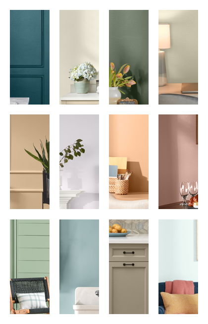
chooses to have "Colors of the Year" rather than just one color. They describe the 2023 collection as "beautiful, livable, ready-to-go shades that restore and rejuvenate any space." The colors in the collection (starting in the left-hand corner and working left to right through each row) include Everglade Deck, Cozy White, Flora, Villa Grey, Holmes Cream, Gentle Violet, Desert Carnation, Southern Road, Green Trellis, Blue Arrow, Ivory Brown, and Rising Tide. Many of the hues we have seen in other Color of the Year selections are noted throughout the Valspar collection. In addition, Valspar has created a fun app where you can explore more about these 12 colors by painting walls, art, and playing games online. Be sure to check it out here.


Photo Courtesy of Valspar

The days of gray are over, and color is making a comeback. Whether you like warm and cozy, or bold and beautiful, the paint and stain experts have something you're sure to love. The overall themes that seem to be showing up on every major paint site I visited are self-expression, well-being, and reconnecting with nature.


So the question is, will you follow the trend and use one of these amazing shades? Or, will you go out on a limb and do your own thing? After all, if it's all about self-expression, the most important thing is to be true to yourself. No matter which path you take, just be sure to paint yourself happy.

Around the House with Kari

Share by: